
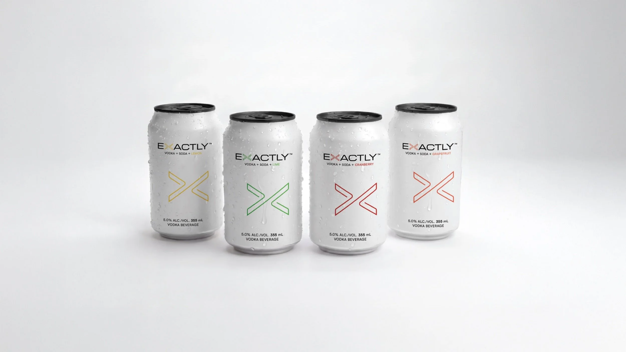
EXACTLY™ Vodka Soda
Brand Identity
Packaging Design
Product Development
2026
How a paper clip became a promise.
Exactly Vodka Soda arrived with three ingredients, a white can and a single letter. Between April and October 2026, PHEIFFER™ turned those constraints into a brand identity, a packaging system, a launch toolkit and two broadcast spots that ran on Sportsnet during Vancouver Canucks home games.
This is the story of that work, in the order it happened.
Client: Meehan Brands
Market: British Columbia, Canada
On shelf: October 1, 2026
Scope: Strategy · Brand identity · Packaging design · Trade marketing and POS · Brand merchandise · Website · Social strategy and content · Motion · Broadcast creative · Project management
The brief
The starting point
April 2026
Order a vodka soda at a bar and you get three things: vodka, soda and a wedge of lime. Buy one in a can today and you usually get more. As the category grew, citric acid, preservatives, sweeteners, artificial flavours and mouthfeel agents crept into the formulas. The promise that built the category stopped being kept.
Paul Meehan knows that promise better than anyone. As a founder of NÜTRL Vodka Soda, he helped create the clean vodka soda category in Canada, built it to the top of the market and exited. Then he watched the category he had built drift away from its promise. So he came back. With Exactly, Meehan Brands set out to keep the promise the category had broken: vodka, soda and natural flavour, exactly as you would order it at the bar.
The brief arrived almost empty, and that was the challenge. There was a name, Exactly. There was a mandate for a visual mnemonic built on the letter X. And the can had to be white. Nothing else was fixed.
Each of those constraints carried a risk:
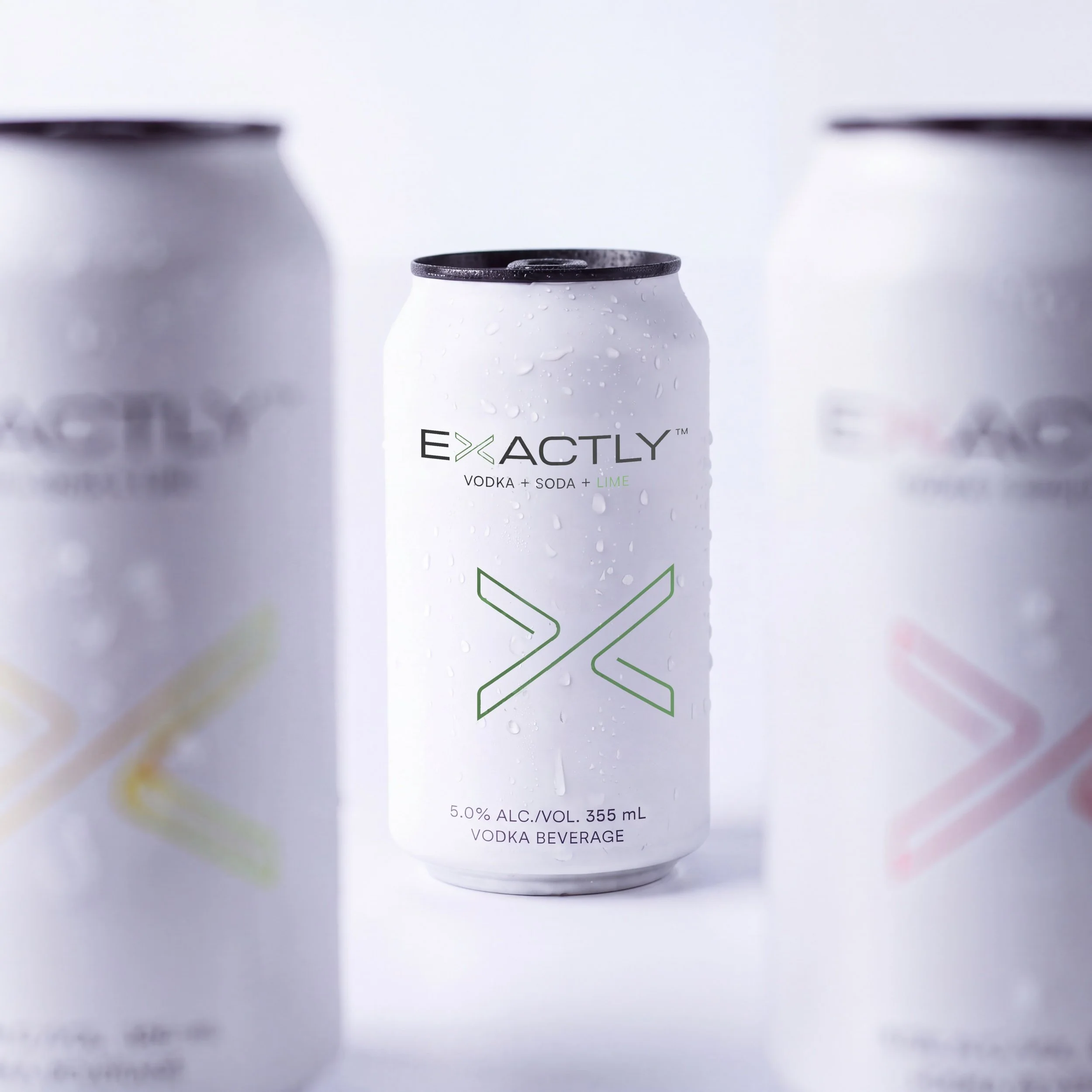
The white can. In clean RTD, white is the default, not a differentiator. Another white can risked disappearing into a wall of white cans.
The letter X. Few letters carry more cultural weight: the X Games, the civil rights movement, the pirate map. One wrong move and the can would read as “X marks the spot.”
We named both failure modes on day one and designed against them for the rest of the project.
-
![Exactly Vodka Soda by PHEIFFER™ — one white Lime can in focus among blurred white cans.]()
One white can among white cans
Identity
Chapter 1
April–May 2026
We started in late April with one rule: deliver the brand with as much restraint as the drink itself. Three ingredients, so the fewest possible moves.
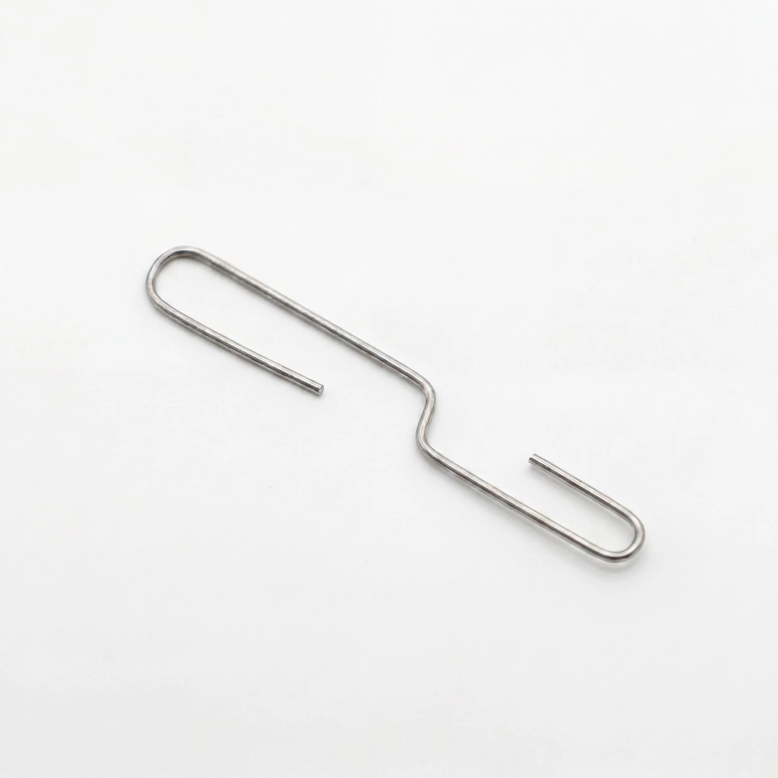
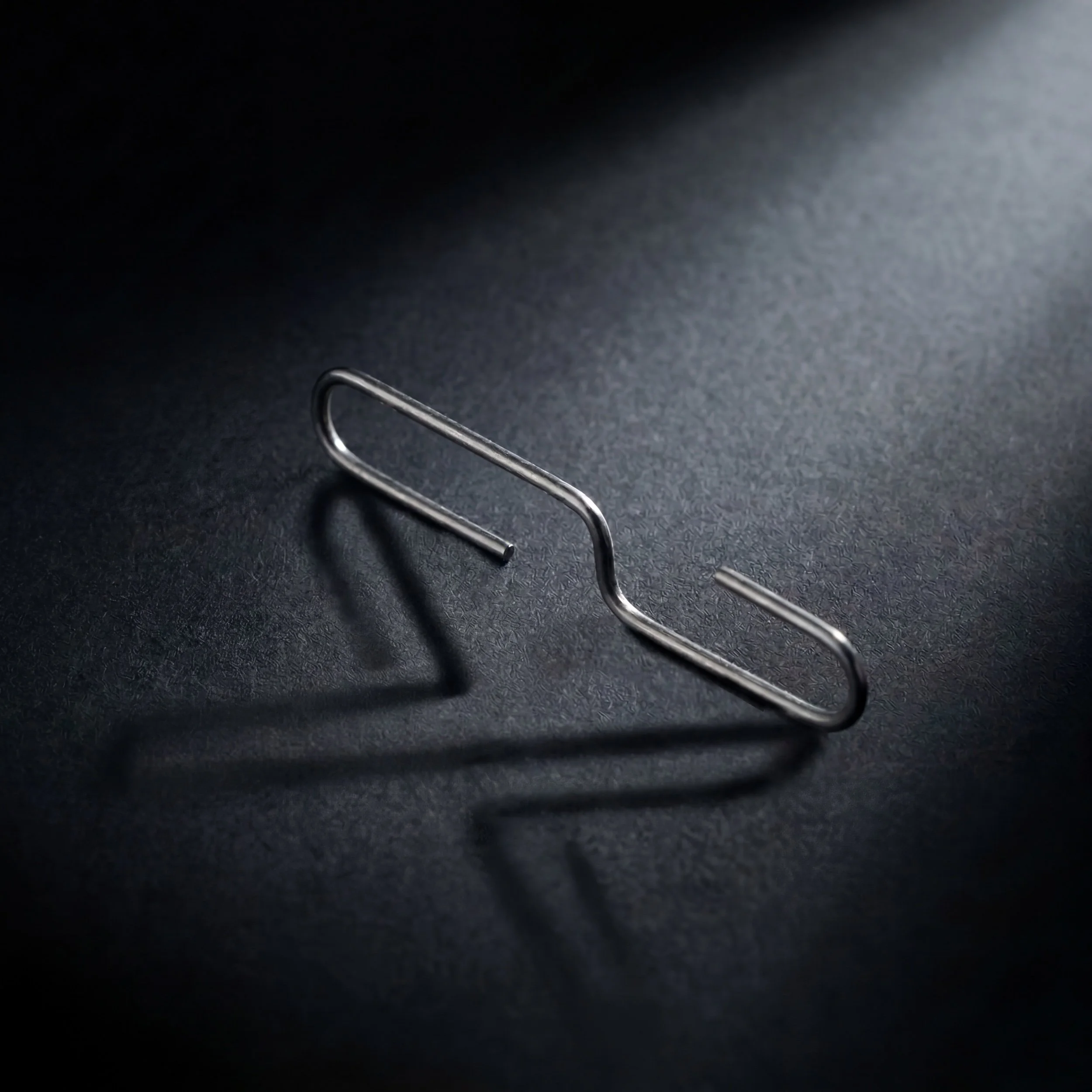
A paper clip, unfolded. The X came from the most ordinary object on the desk. The paper clip is one of the simplest designs in human history, and it has never needed improving. Unfolded, it gave us the direction we sprinted toward: an X drawn as a single continuous line.
The letter X can feel like a heavy, brutalist concrete building: solid, imposing, closed. Shaping the mark from the unfolded paper clip, we had to knock out some walls and put in glass windows, inviting the outside in.
Most X’s are two bold heavy strokes crossing. Ours is one connected form. With the interior stripped away and only the perimeter kept, the mark reads as an X and, at a second glance, as a greater-than and less-than sign facing each other: a small visual oxymoron inside one mark. The fluid line holds the flavour colour, so the white of the can becomes part of the colour story.
A custom typeface. We drew a custom typeface for the wordmark, built around the mnemonic. The single-line X sits inside the word itself, so the name and the mark read as one.
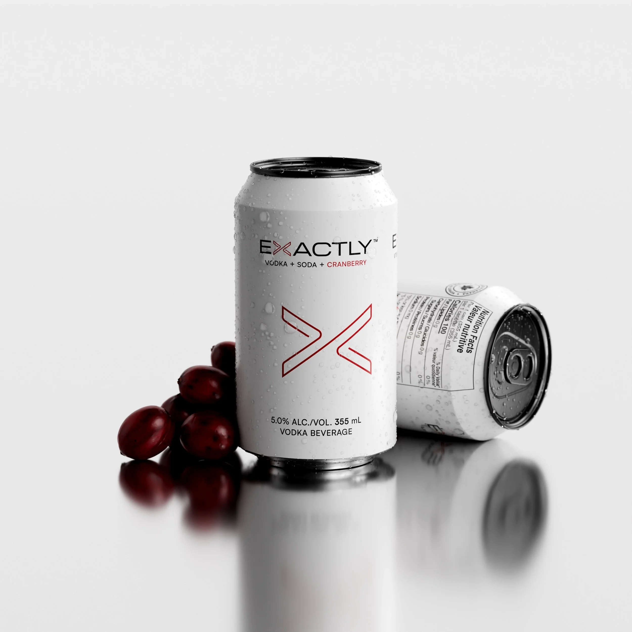
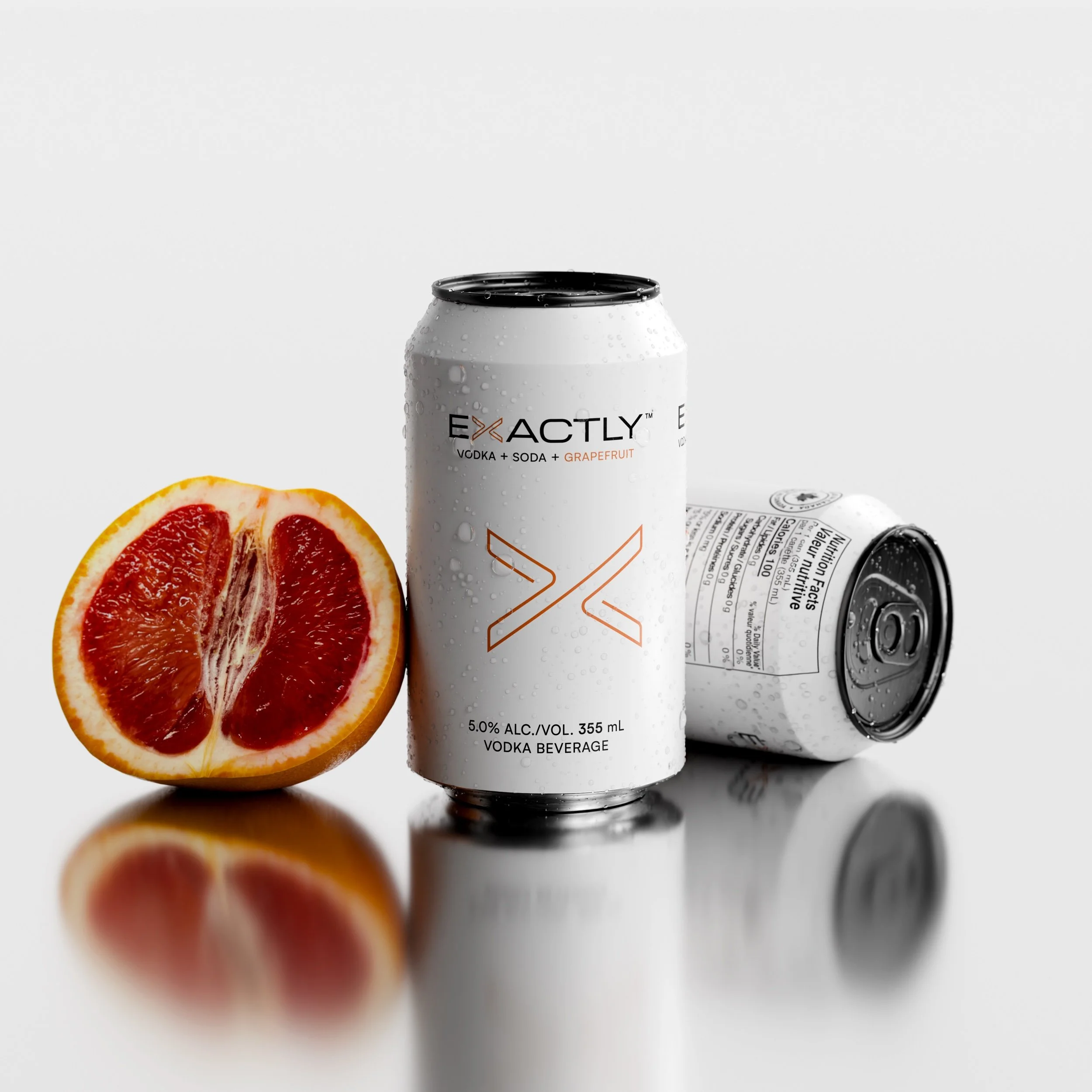
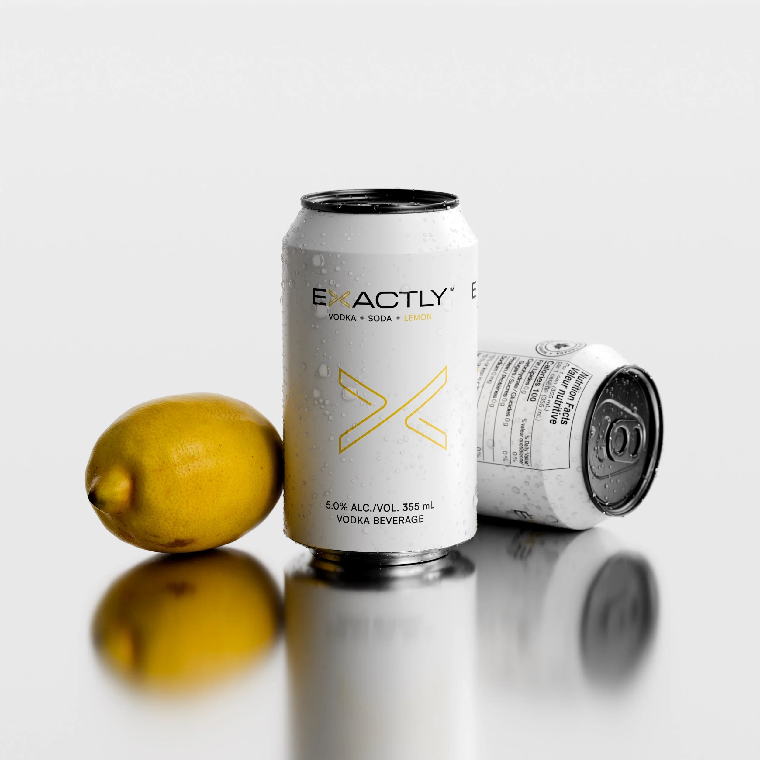
The colours themselves came from real fruit. We matched each Pantone to an actual lime, lemon, cranberry and grapefruit, choosing the most mature tone of each, rather than the synthetic shades the category uses.
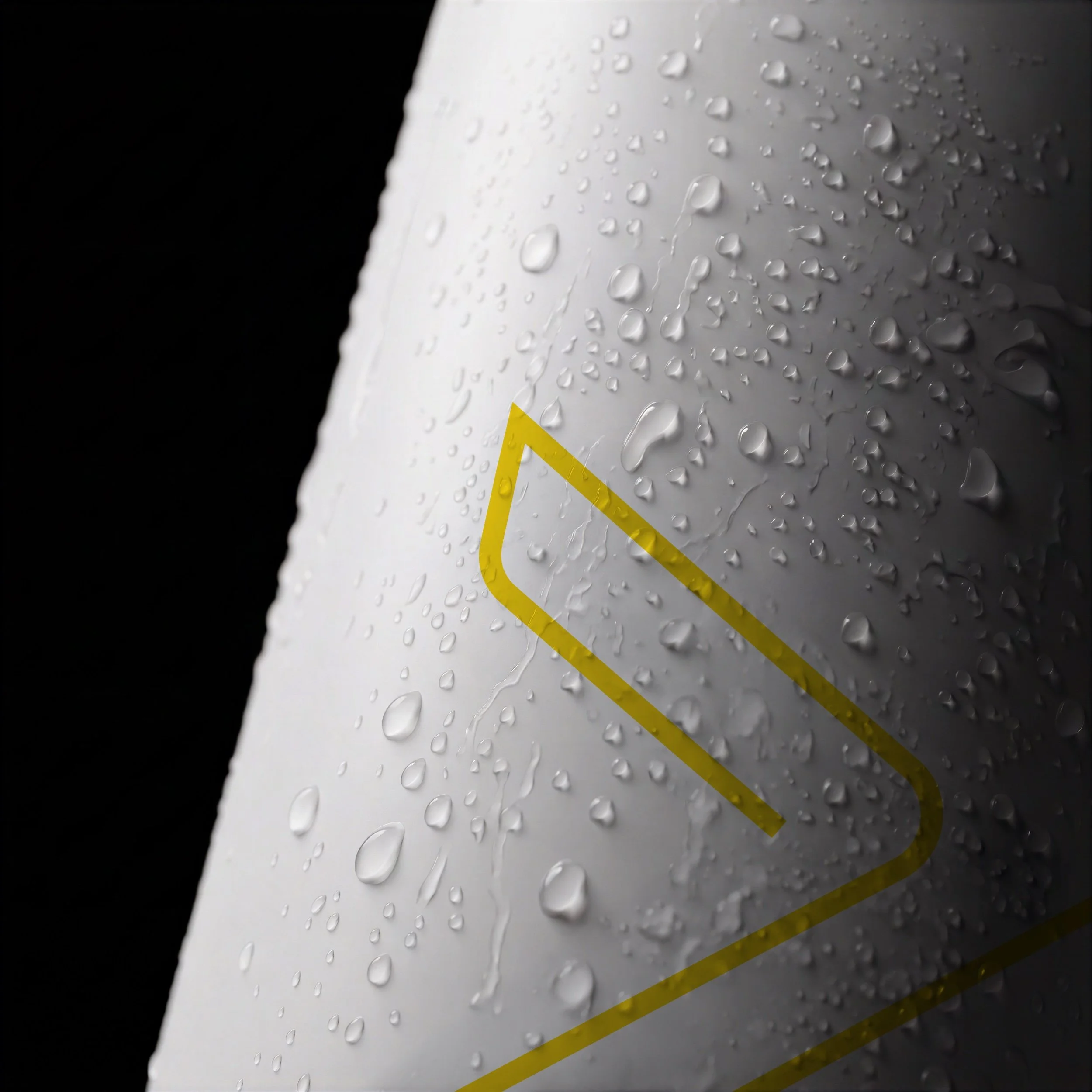
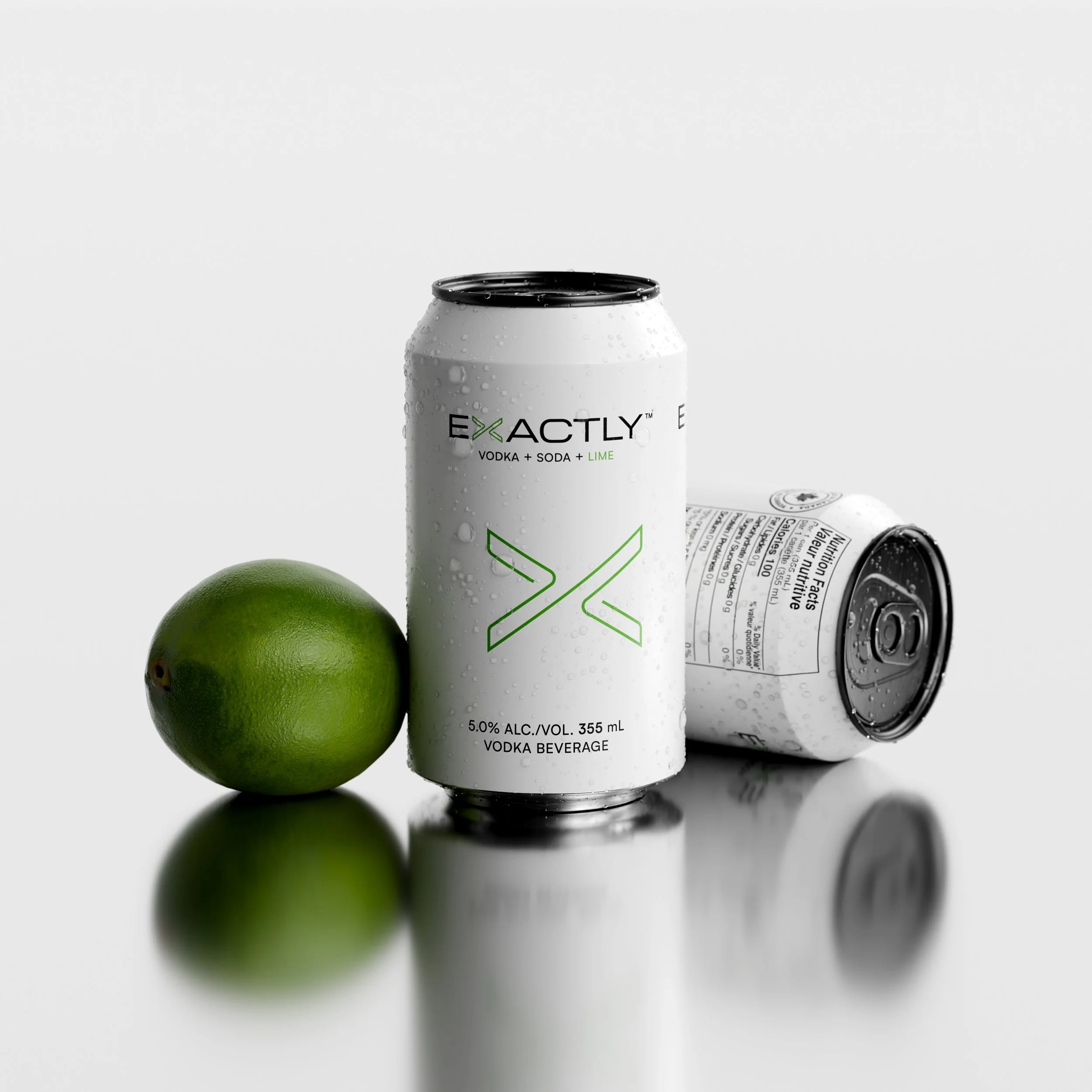
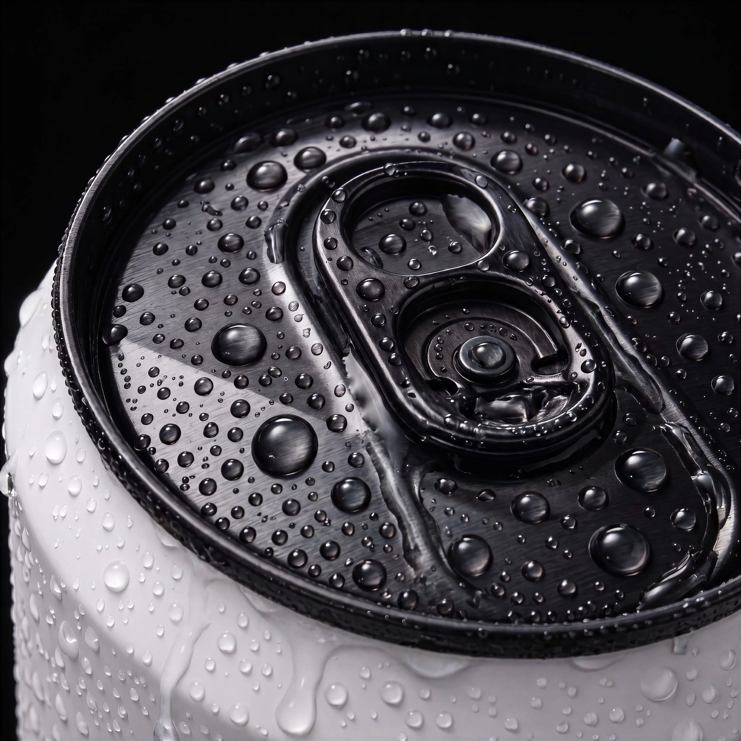
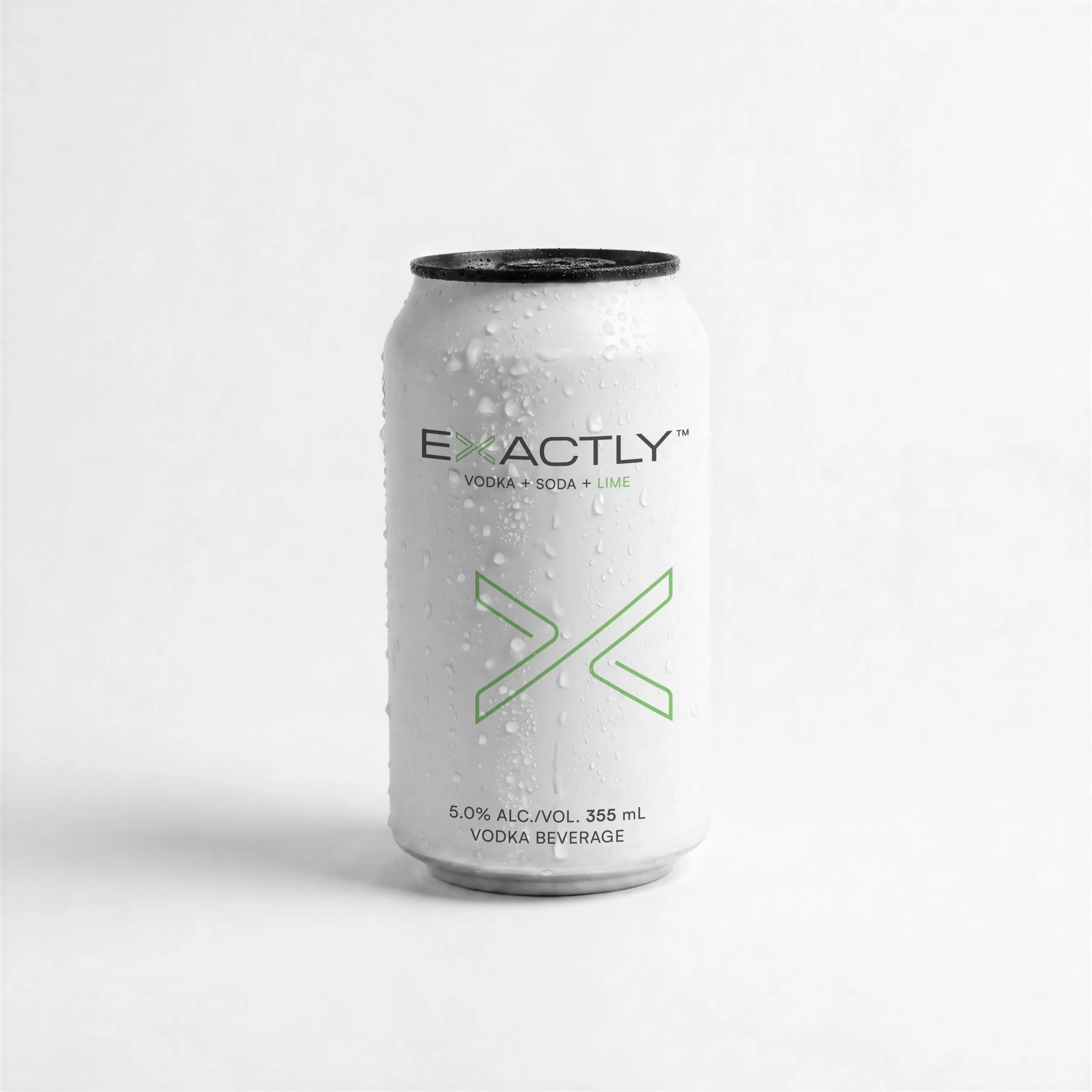
The black can end. The white can still had to stand out. On store shelves we noticed that coloured can ends appear in energy drinks and sometimes beer, but never in RTD spirits. Nobody had questioned why the lid had to be plain aluminium.
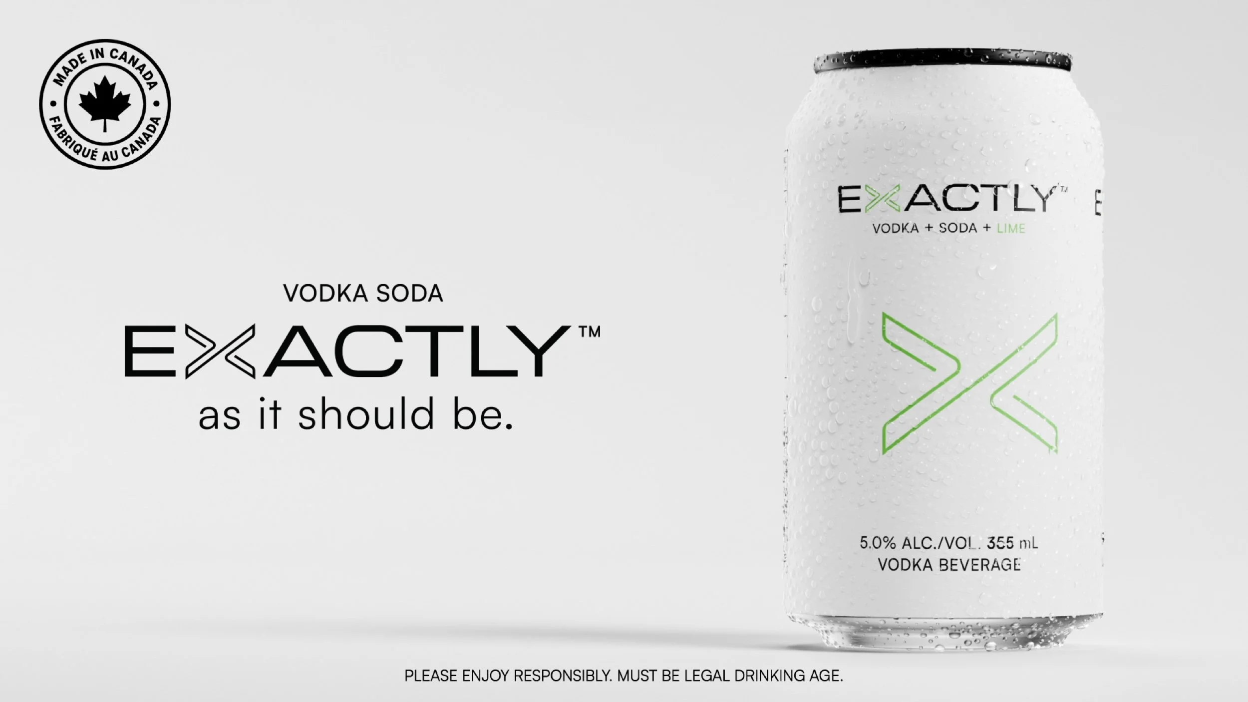
So we kept the can matte white and topped it with a polished black end. As your eye scans a cooler, the black end interrupts the field of white. It became a second brand identifier, and later, on air, it would become something else entirely.
Together, the custom wordmark carrying the mnemonic, the expanded X and the contrasting can end let Exactly stand out while keeping every constraint the founder set.
-
![Exactly Vodka Soda by PHEIFFER™ — an unfolded paper clip on white, the origin of the single-line X.]()
The paper clip, unfolded
-
![Exactly Vodka Soda by PHEIFFER™ — the unfolded paper clip casting an X-shaped shadow.]()
The unfolded clip and its X-shaped shadow
-
![Exactly Vodka Soda by PHEIFFER™ — close-up of the single-line X on a matte white can.]()
The single-line X on matte white
-
![Exactly Vodka Soda by PHEIFFER™ — the Cranberry can beside fresh cranberries.]()
Cranberry
-
![Exactly Vodka Soda by PHEIFFER™ — the Grapefruit can beside a cut grapefruit.]()
Grapefruit
-
![Exactly Vodka Soda by PHEIFFER™ — the Lemon can beside a lemon.]()
Lemon
-
![Exactly Vodka Soda by PHEIFFER™ — the Lime can beside a cut lime.]()
Lime
-
![Exactly Vodka Soda by PHEIFFER™ — close-up of the polished black can end.]()
The polished black can end
-
![Exactly Vodka Soda by PHEIFFER™ — the matte white Lime can with its black end.]()
Matte white, black end
Packaging
Chapter 2
May–June 2026
Most shoppers meet a brand like this for the first time through the 6 × 355 mL carton, not a single can in a fridge.
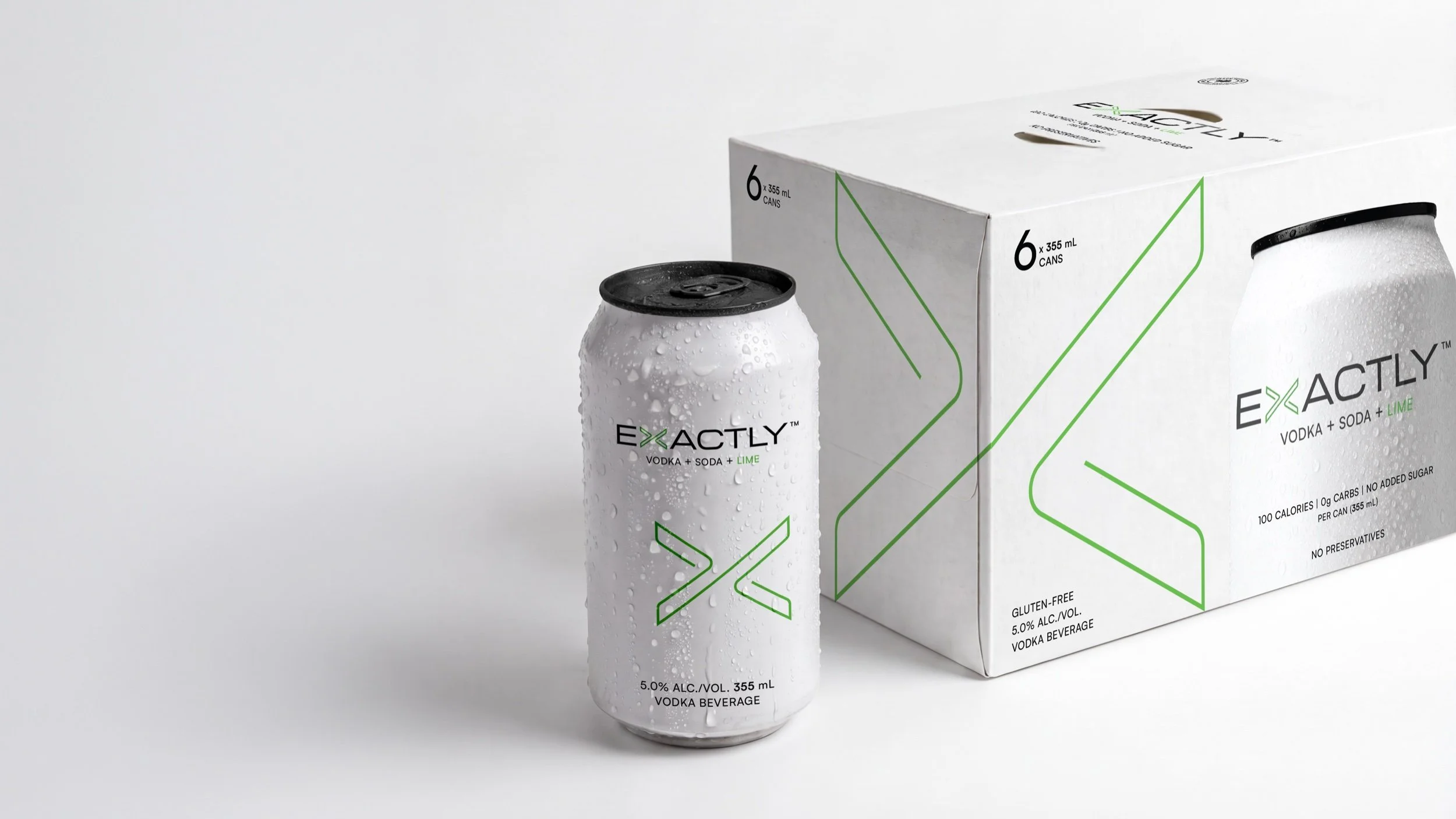
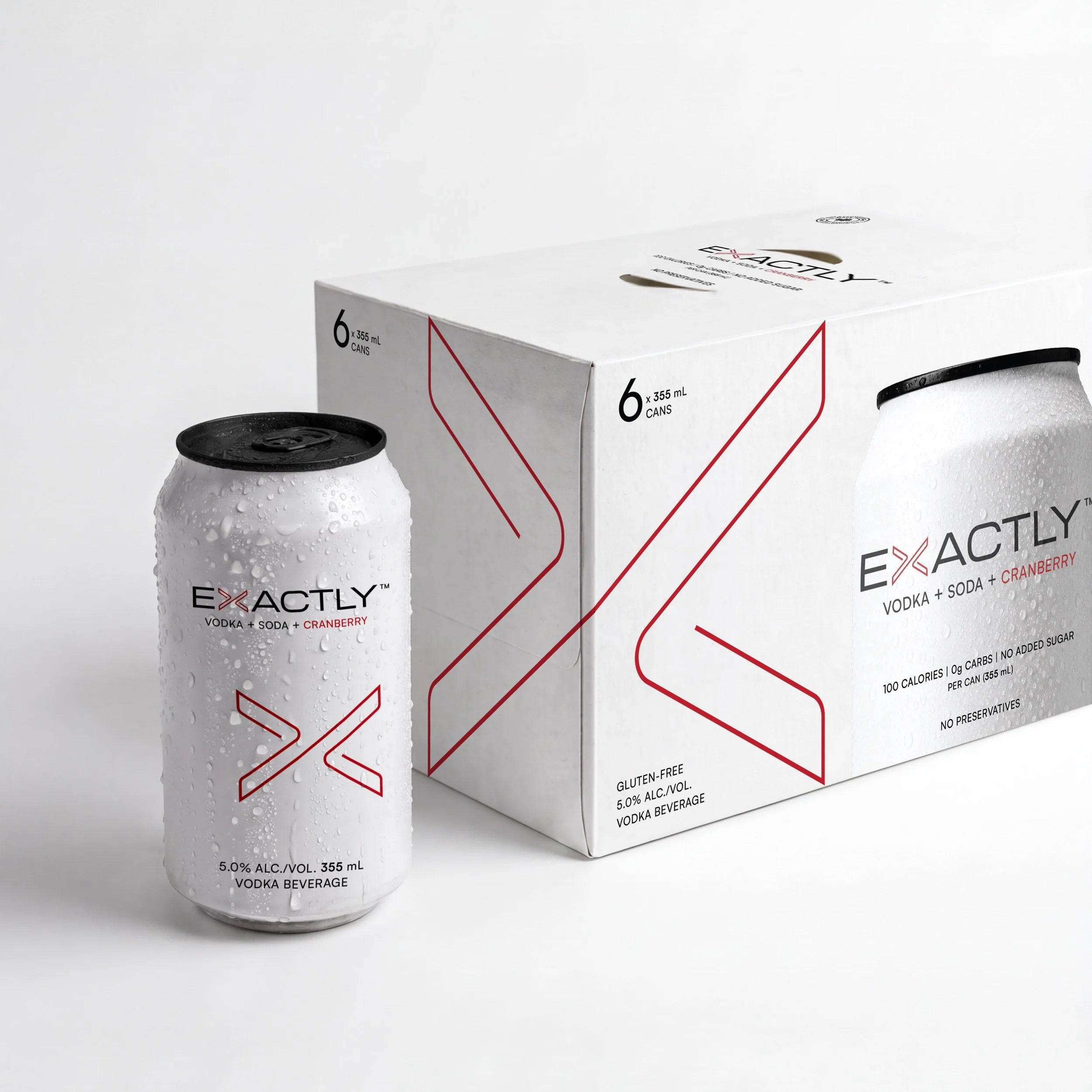
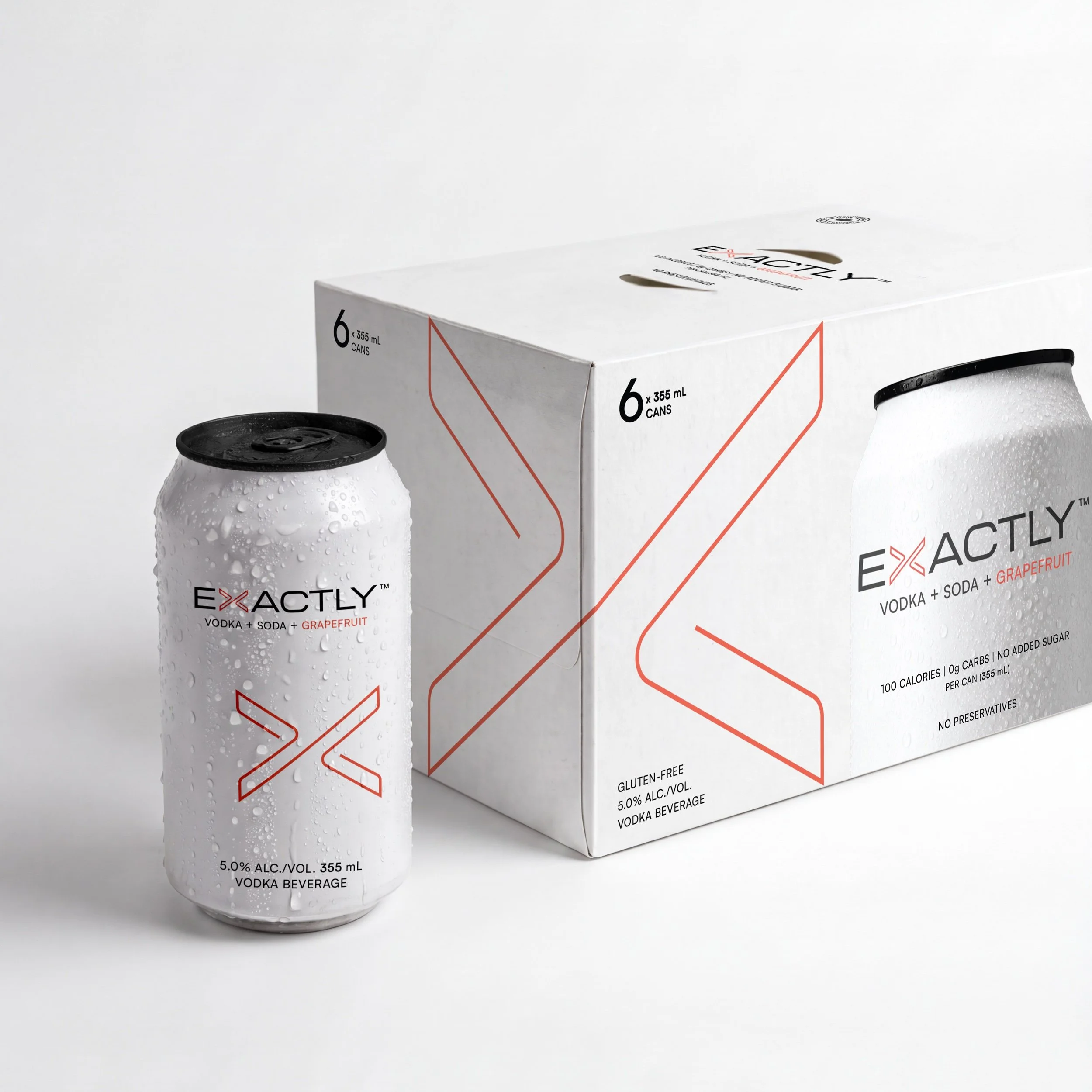
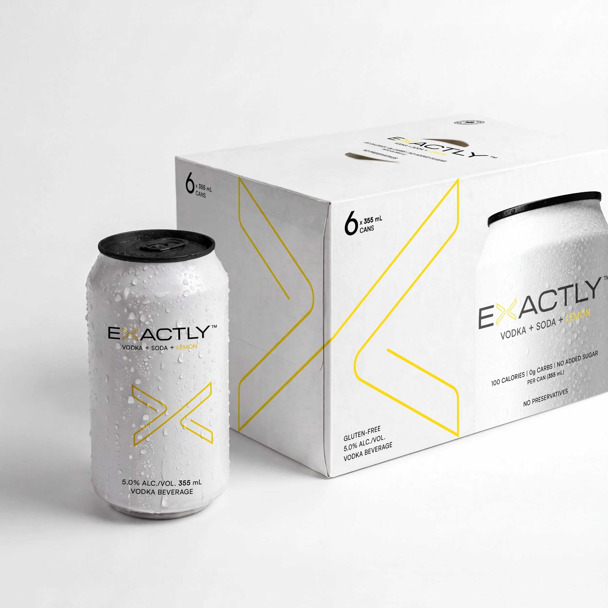
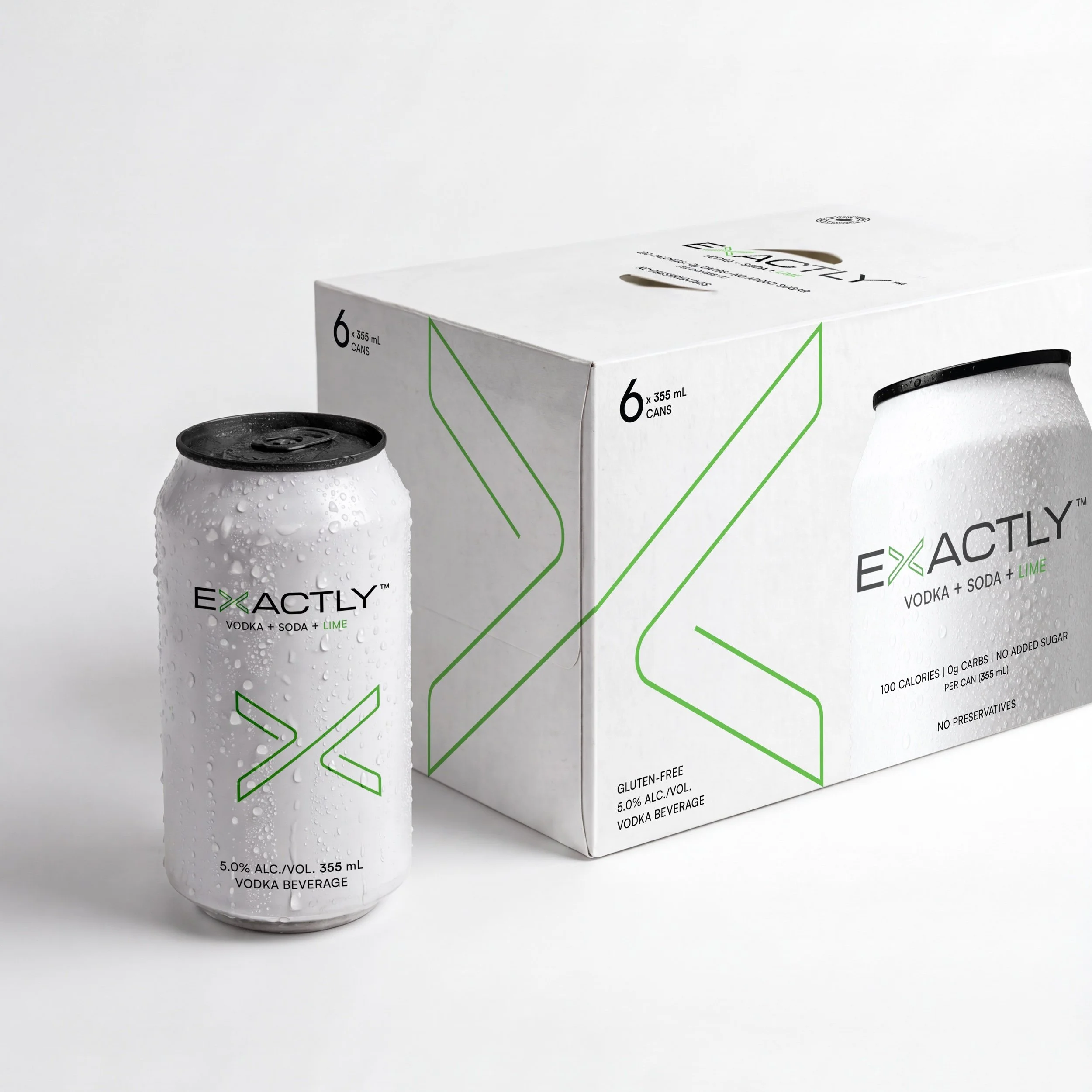
The carton as an editorial spread. We stopped treating the carton as a box and started treating it as a magazine spread. The X wraps around the corner, half on each face. Turn the carton and you see the individual pages; look at the corner and the full mark resolves, like an image bleeding across the gutter of an open book. Stack the cartons in a store display and they build a wall of X’s, almost a monogram print.
The long face carries a large image of the can itself, black end and all. It is designed to build trust: shoppers see exactly what is inside before they open it, and the mnemonic lands a second time.
Built into the architecture. Because the wrapped edge is part of the system, it scales. The 24-can trays carry the same wrapped X with the full brand name, so every surface delivers the name, the mark and the product.
The final cans, cartons and trays went to production in June 2026, with print-ready files for every flavour, about nine weeks after kickoff.
-
![Exactly Vodka Soda by PHEIFFER™ — the Lime can beside its 6-can carton, the X wrapping around the corner.]()
Can and carton · Lime
-
![Exactly Vodka Soda by PHEIFFER™ — the Cranberry 6-can carton.]()
Carton · Cranberry
-
![Exactly Vodka Soda by PHEIFFER™ — the Grapefruit 6-can carton.]()
Carton · Grapefruit
-
![Exactly Vodka Soda by PHEIFFER™ — the Lemon 6-can carton.]()
Carton · Lemon
-
![Exactly Vodka Soda by PHEIFFER™ — the Lime 6-can carton.]()
Carton · Lime
Launch
Chapter 3
August–October 2026
With the identity and packaging set, we built everything the brand needed to reach the shelf on October 1.
Trade marketing, in two and a half weeks. Reps needed off-premise tools for liquor stores before the product landed: a sell sheet, rep sheets, posters, wobblers, shelf talkers, price cards, fridge clings and backer cards. We designed the full kit in about two and a half weeks. The rule was the same as on the can: say as much as possible in as few words as possible, and keep every piece restrained and clean.
Brand merchandise. Launch apparel for the sales team carried the same visual language off the shelf and into the room.
A website that colours itself in. We built a responsive site with a small surprise in the scroll. It opens on the family lineup. As you scroll, each flavour steps forward on its own, and its Pantone floods in as it passes: vodka + soda + cranberry, then the next. The site also carries the age gate, a store locator and the brand story. It went live in September, ahead of the October launch.
Motion and three months of social. We rendered four 360° turntables, one per can, at full resolution. Every frame doubles as a product shot. From those renders and further 3D work, we built a backlog of social content for the brand’s first three months: three posts a week mixing reels, statics and stories, enough to run from launch to Christmas.
Everything was mapped into a matrix the team could hand straight to a social media manager, with dates, captions, approvals and a link to each asset. Alongside it sat a strategy playbook of close to 40 pages: who Exactly’s consumers are today, who they aspire to reach, and where those consumers will be in two years and in five.
-
![Exactly Vodka Soda by PHEIFFER™ — a still from the 360° turntable render of the Cranberry can.]()
Turntable still · Cranberry
-
![Exactly Vodka Soda by PHEIFFER™ — launch social post revealing the X.]()
Launch post · the X reveal
On air
Chapter 4
September–October 2026
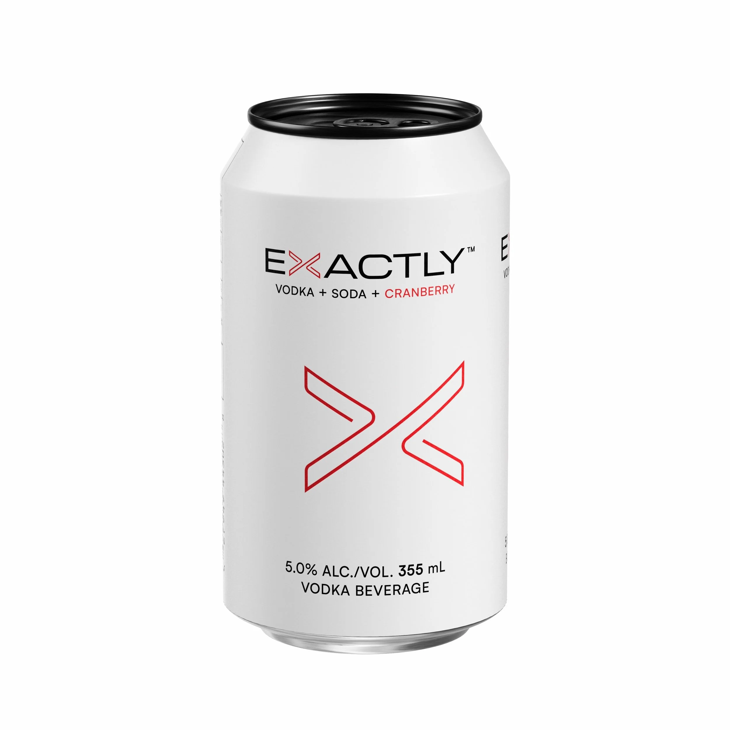
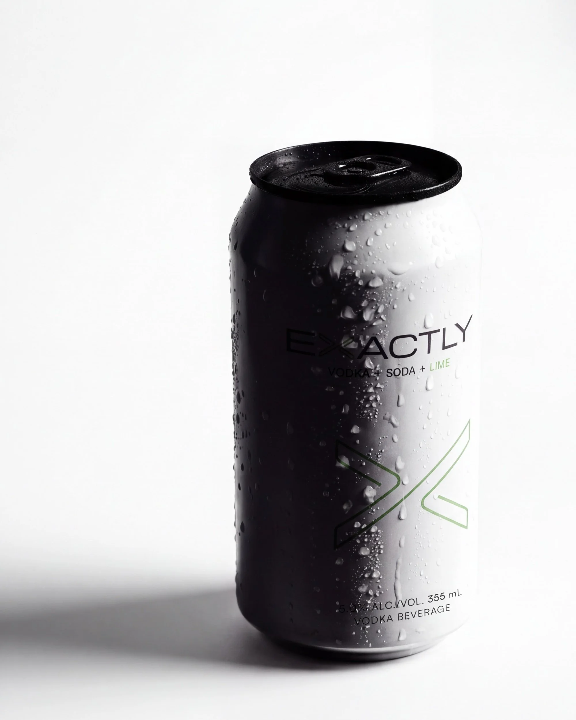
The final step took Exactly to broadcast. We created and produced a 10-second and a 15-second spot for Sportsnet and Sportsnet+, airing during Vancouver Canucks home games. Each had to land the brand in seconds, and speak to an ordinary hockey fan watching at home.
“Introducing”, 10 seconds. A brand hero: one continuous camera move across the Lime can, from the condensation to a held end slate. Product and type only, built to work with the sound off.
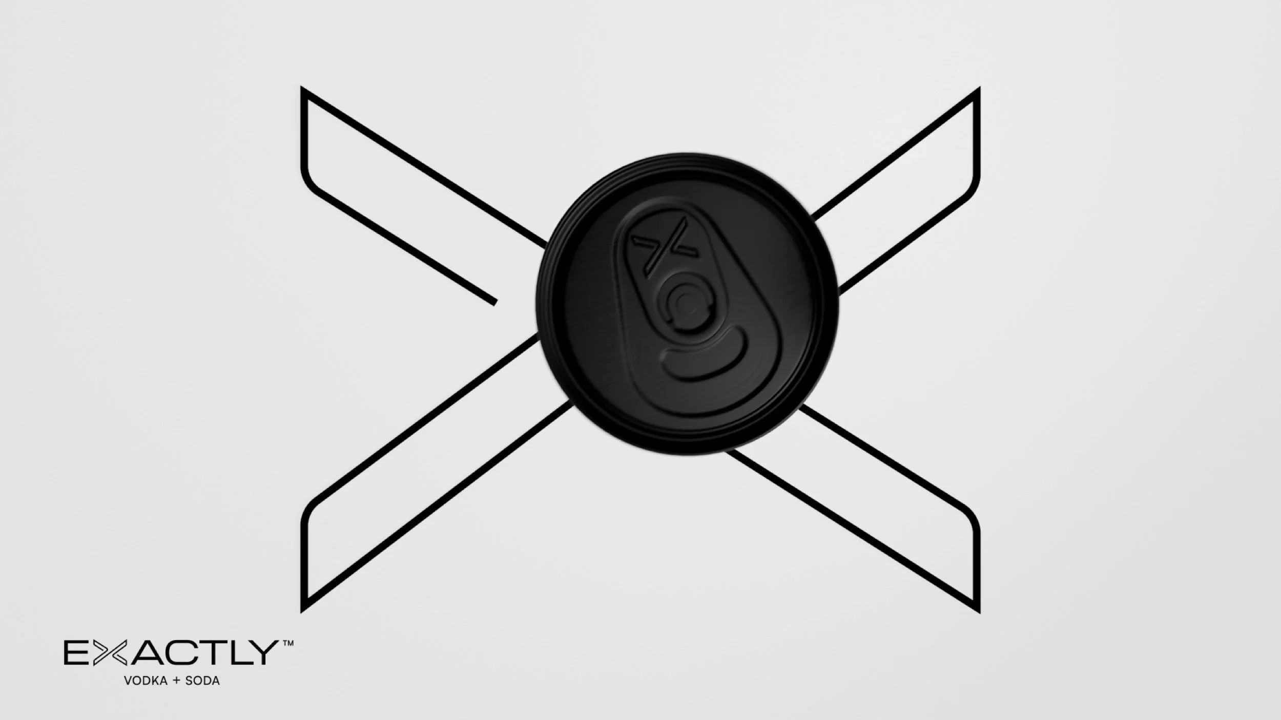
When it first aired, people started telling us the black can end looked like a hockey puck. We smiled. We already knew, and the next spot was built on it.
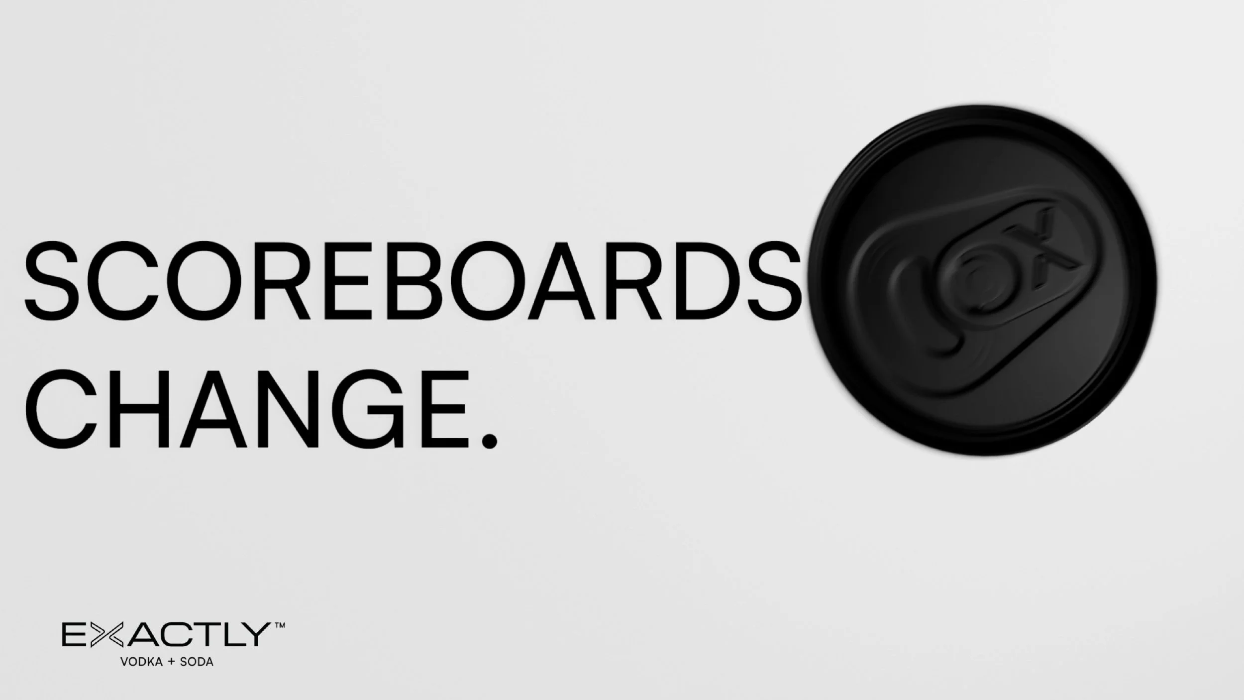
“The Scoreboard”, 15 seconds. Seen from above, in motion, the black can end is almost an exact replica of a puck. So we let it play. The lid slides across a clean white surface like an air hockey table, bouncing off the three ingredients and drawing the X. As it comes to rest, the camera tilts down to reveal the can.
An idea planted months earlier, in a decision about a can lid, came all the way around to broadcast.
-
![Exactly Vodka Soda by PHEIFFER™ — frame from The Scoreboard: the black can end slides like a puck and draws the X.]()
The Scoreboard · the lid draws the X
-
![Exactly Vodka Soda by PHEIFFER™ — opening frame of The Scoreboard broadcast spot.]()
The Scoreboard · opening line
-
![Exactly Vodka Soda by PHEIFFER™ — end slate of The Scoreboard broadcast spot.]()
The Scoreboard · end slate
Outcome
The result
October 2026
Exactly reached BC shelves on October 1, 2026, with its trade kit in reps’ hands, its website live, three months of social content ready to run and two spots on air during Canucks home games.
At the end of October we walked Meehan Brands’ marketing manager through every asset and handed the full library over, so the team can run the brand on its own. PHEIFFER™ continues to support the brand as it grows across Canada, from reactive work to new flavours and line extensions.
“If you’re a brand or service in any space looking for super tasteful design, clever perspective, clear project management and just an excellent experience, PHEIFFER™ comes with my strongest recommendation. This gentleman and his company are locked in.”
Paul Meehan, Founder · NÜTRL Vodka, EXACTLY Vodka Soda, Meehan Brands
None of the big decisions here were really about a can. Each was the same way of thinking: strip the work to its essentials, then make the essentials carry everything. A paper clip became a mark, a can lid became a hockey puck, and a white can became impossible to miss. That is Everyday Awe: finding something extraordinary in what is already in front of you.
-
![Exactly Vodka Soda by PHEIFFER™ — a can and a glass with ice and a lime wheel, in silhouette on a white ground.]()
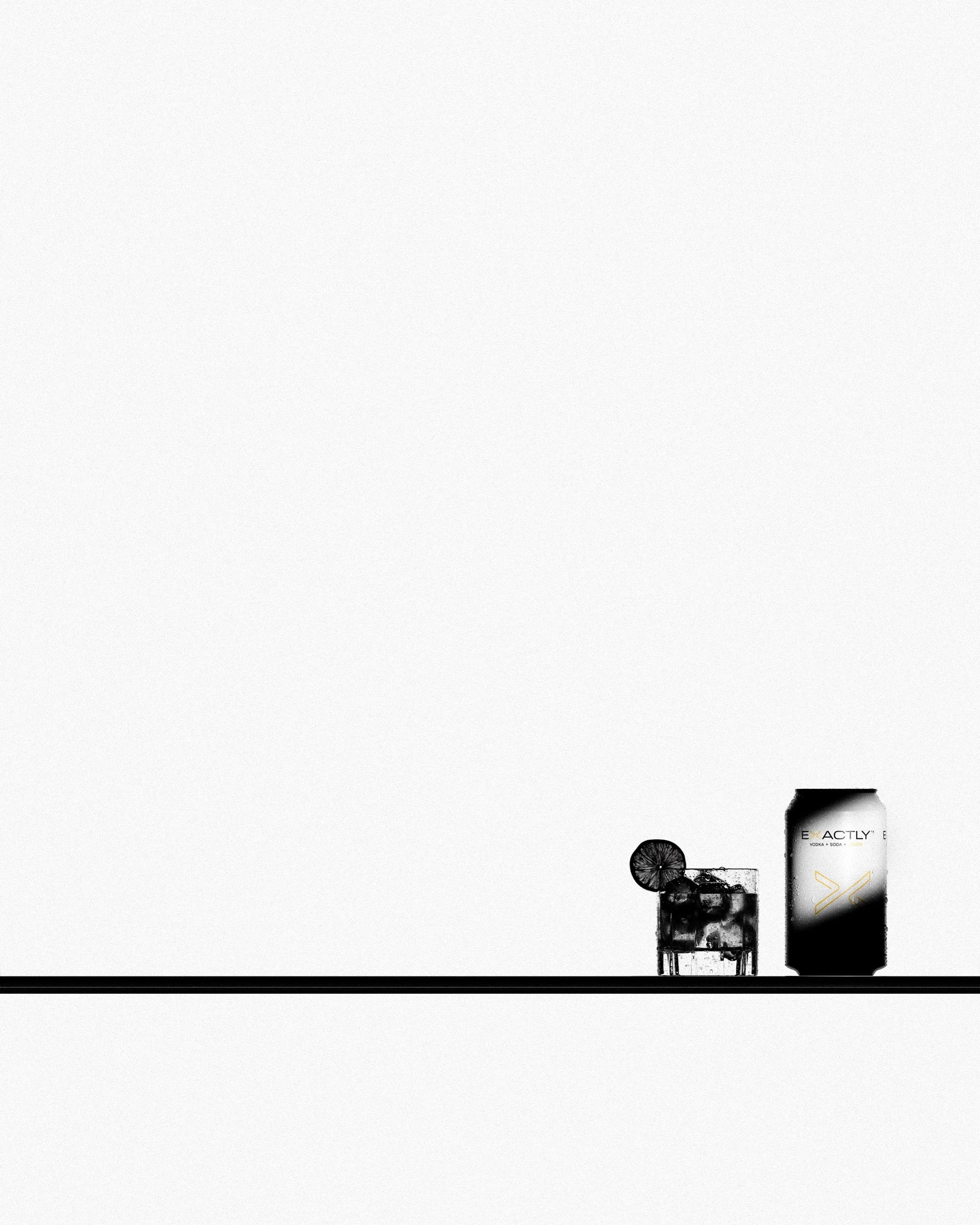
Vodka, soda, lime
Project facts
At a glance
2026
Client: Meehan Brands
Product: Exactly Vodka Soda: vodka, soda, natural flavour
Flavours: Lime, Lemon, Cranberry, Grapefruit
Formats: 355 mL can, 6 × 355 mL carton, 24-can tray; glass bottle in development
Market: British Columbia, Canada
Timeline: Identity and packaging, April–June 2026; launch, August–October 2026
On shelf: October 1, 2026
Broadcast: Sportsnet and Sportsnet+, Vancouver Canucks home games
Studio: PHEIFFER™, Vancouver